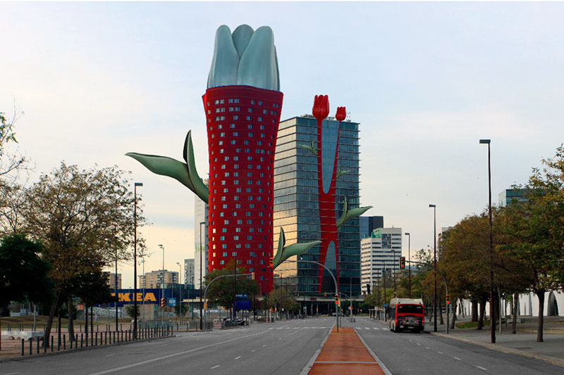
Tulip Tower
The term generic cities refers to urban areas that share similarities in their physical design, architectural style, and overall urban planning—creating a sense of uniformity that lacks the unique characteristics, cultural diversity, and historical depth that distinguish them from one another.
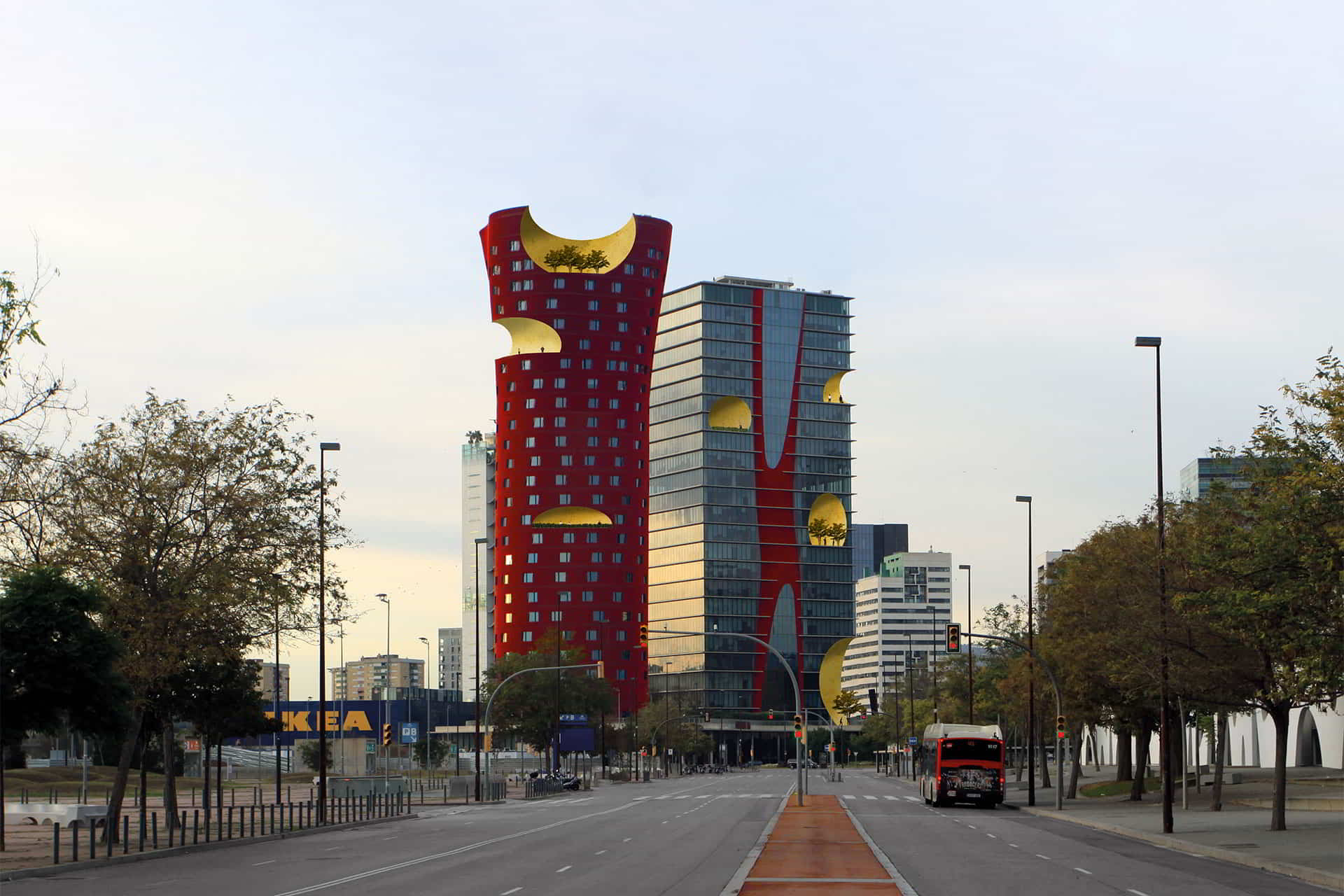
The photo shows the two buildings by Toyo Ito located in Zona Franca, Barcelona, Spain. This area serves as a testing ground for innovative ideas in economic development, metropolitan growth, and environmental sustainability, considering its location in the Llobregat Delta and the need to preserve local natural assets.

The project consists of two distinct towers that engage in a subtle dialogue. Despite the clear contrast between the buildings in terms of form, there is a subtle yet evident harmonious and complementary relationship.
The hotel tower was designed with an organic shape and appears to change as one moves around it.
The office tower complements and responds to the perceived torsion and movement of the hotel building. At first glance, appears to be a pure volume with a slightly recessed glass curtain wall slightly recessed from the floor slab. However, the red vertical core of the building, located at the edge of the ground floor, has an organic form and reflects the structure of the hotel tower, has an organic form and reflects the structure of the hotel tower.
Breaking Boundaries
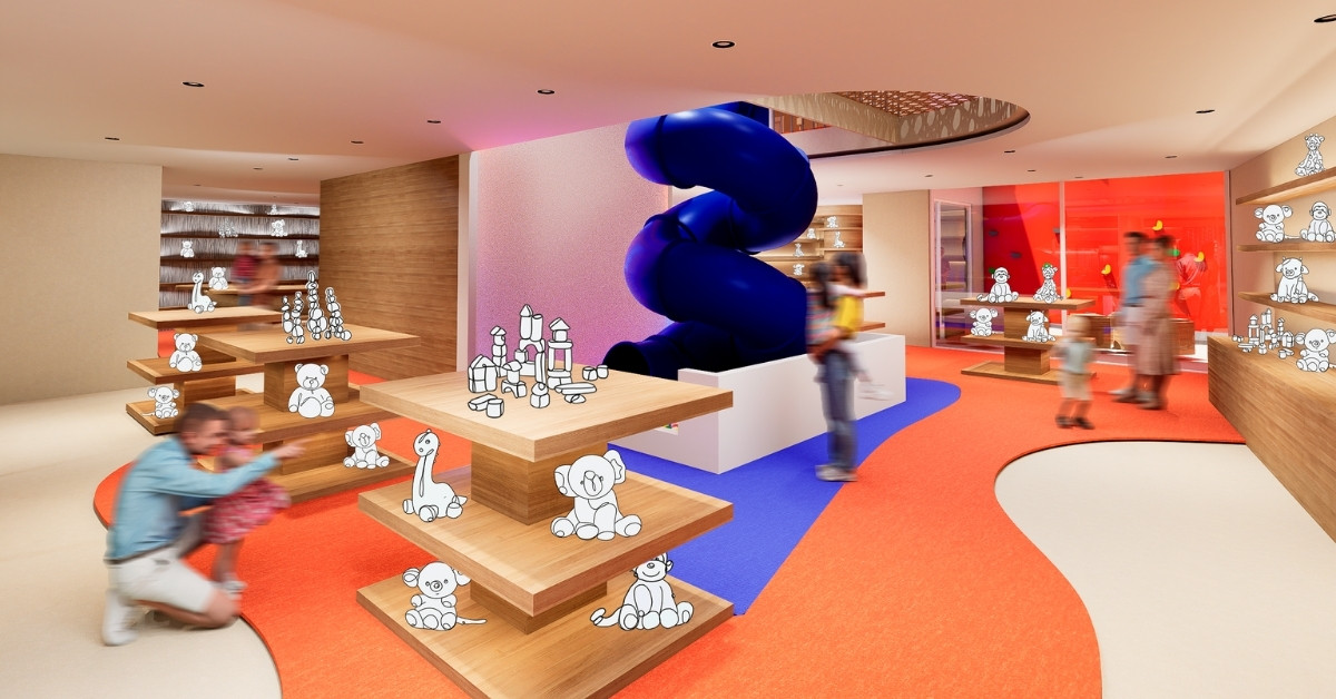
After analyzing the reference, we observed that these openings in the façade create unity and distinguish it from generic buildings. The openings are designed as a way to break free from the constraints of a typical, conventional building. Through careful consideration of proportions, positioning, and balance, the circular voids emerge within the structure. The reuse of each opening transforms the building into a unique entity with non-repetitive elements. This unique approach led us to assign a purpose to these spaces, creating balconies where various activities can take place.
Visual Projection
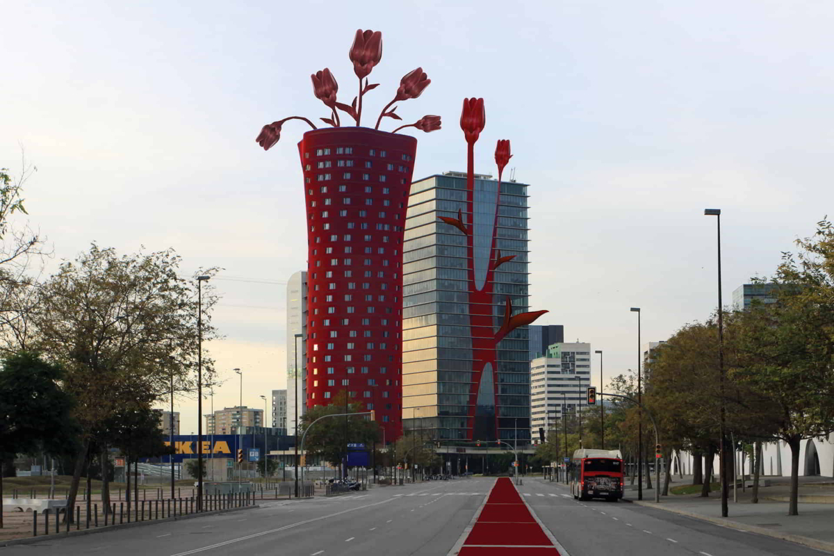
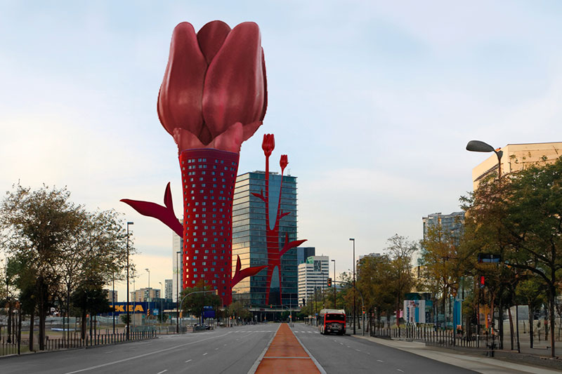
Firstly, after analyzing the building plans and the difference in materials visible on the facade, we can interpret that the red used on the facade highlights the structure and the location of the core of both buildings: one positioned at the edge and the other at the center.

Secondly, we took advantage of the organic shapes of the buildings and sought to express them in a more visually representative way. Regarding form, we identified a tulip flower in two ways: the stem for the office building and a vase for the hotel.
To give it meaning, we assigned the following interpretation: the way it appears/grows “bare”, revealing all its characteristics, represents the hotel, while the way it is “covered”/utilized when placed in a vase where the stem is barely visible symbolizes the office building.
Since the stem represents the “core” of the building, we decided to apply the same materiality as the building itself, extending this even to the most visible elements making the sidewalk seemingly disappear.